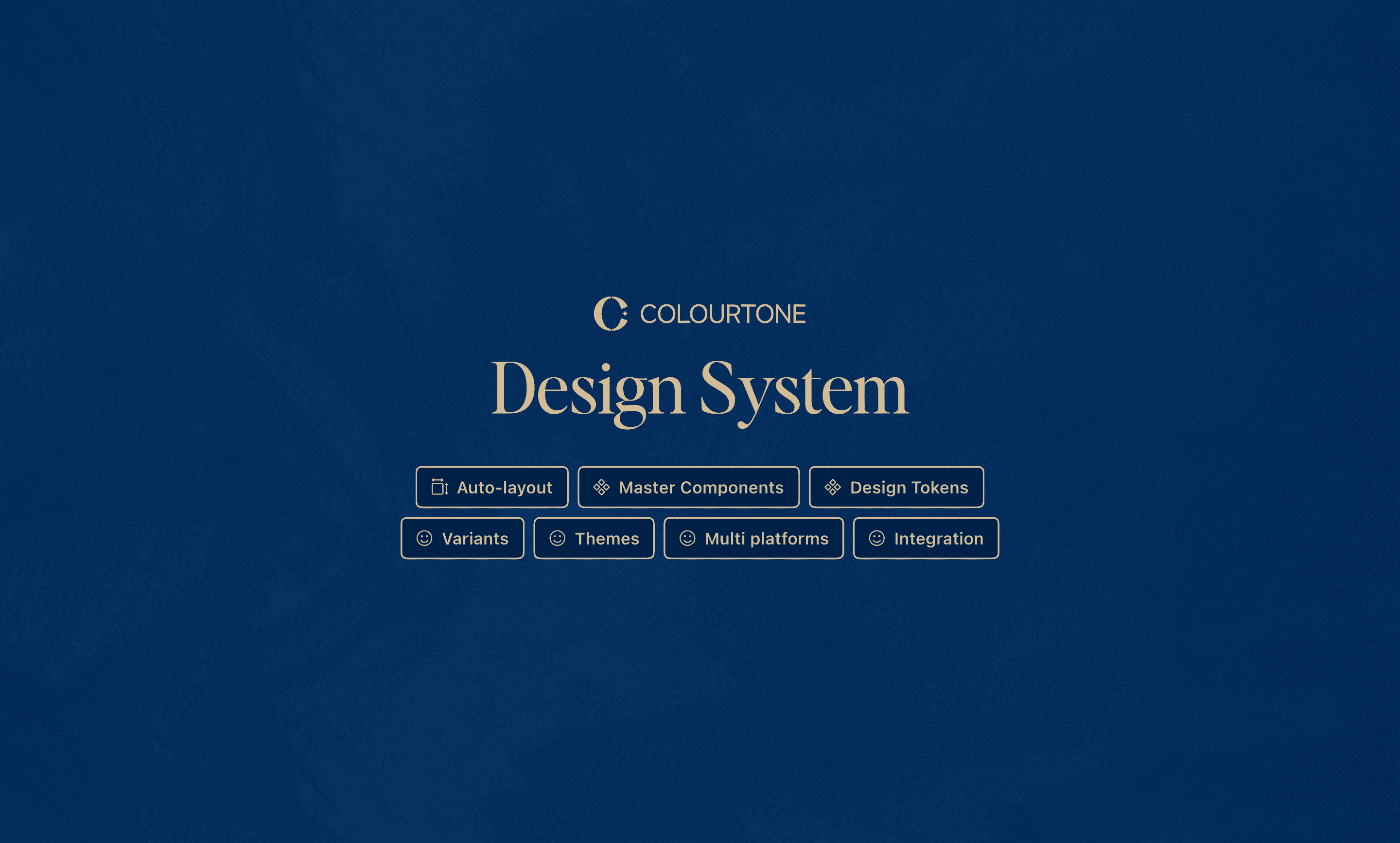
Building a Scalable Multi-Platform & Multi Theme Design System for Colourtone
Article Podcast
Role
Lead UI Designer
Design System Designer
Logo Designer
Skills
UI Design
UX Design
Design System
Design Token Management
Logo Design
Tools
UI Design
UX Design
Design System
Design Token Management
Logo Design
Team
Sam - UI Product Designer & Design System Designer
Estee - UX Product Designer
Sunny - Product Manager
Timeline
June 2024 - December 2024
My Role
I champion the full lifecycle of the design system development, from strategy to execution. My responsibilities included:
Conducting a full UI audit to identify inconsistencies and inefficiencies
Defining the system architecture, taxonomy, and token framework
Creating modular, responsive components and patterns in Figma
Implementing and managing design tokens and Figma Variables
Building a flexible theme structure to support light/dark modes across platforms
Our Goal
Unify the Visual Language
Ensure a consistent experience across mobile, tablet, and desktop platforms
Build for Scale
Design a flexible system that would accommodate future features, brand changes, and platform growth
Support Theming
Use Figma Variables and token collections to enable light/dark themes and platform-specific styles
Bridge Design and Engineering
Create a shared source of truth through token pipelines and system documentation
Accelerate Velocity
Reduce time to design and ship features through reusable components and standardized practices
System Highlights
Figma Variables & Design Tokens
Challenges
When I learned that the Colourtone project would support both light and dark themes across mobile, tablet, and desktop, I realized that managing styles manually would be difficult to scale and maintain. Updating components for multiple platforms was time-consuming and often led to inconsistent styling. With a detailed, design-focused client, I needed a more flexible and centralized approach to ensure consistency, reduce duplication, and streamline updates across the entire system.
The Solution
To address these challenges, I implemented Figma Variables as the foundation for managing all design tokens including color, spacing, typography, and component sizing. By organizing tokens into clear collections and modes, I enabled seamless theme switching and platform-specific adaptations, making the system more scalable, consistent, and easier to maintain.
Design Token Naming Structure
Challenges
As the design system grew, managing tokens without a clear naming structure became difficult. It was confusing for both designers and developers to know which tokens to use especially across different platforms and themes. I experienced this in a previous works, where we often struggled to stay consistent. It became clear that we needed a better, more structured token naming system.
The Solution
To address these challenges, the following section shows how I solved them

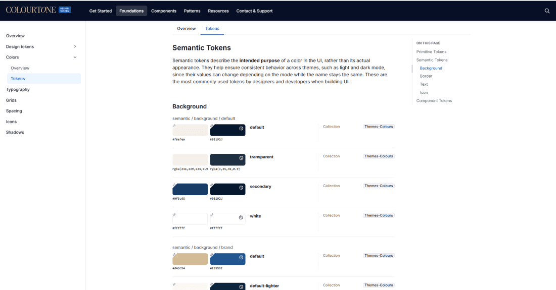
I created a structured naming system using the format: [component.property.role.state]
This naming structure ensures clarity and consistency across the system making it easier to scale, maintain, and bridge the gap between design and development.
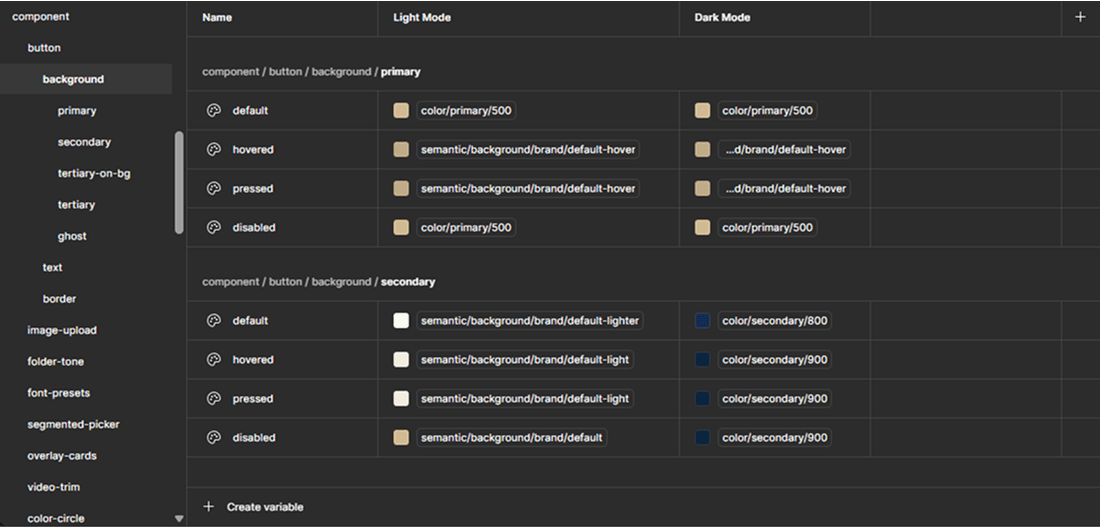
Structure in figma variables
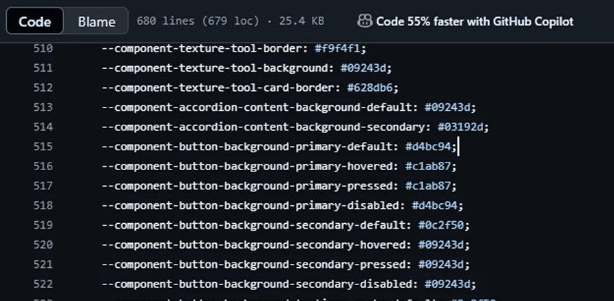
Design token naming structure in JSON
Guide for Naming Design Token
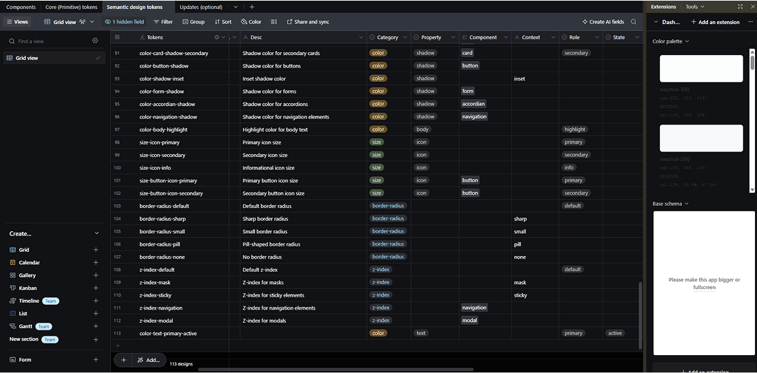
To guide the creation of a scalable and structured token naming system, I used Airtable to map out components, properties, roles, and states. Ensuring consistency for designers and providing a clear, reliable reference for developers across the entire system
Figma Variables Structure

Design Token Application Across Platforms and Themes
Thanks to a well-structured naming convention and scalable design tokens, the system adapts seamlessly across devices and themes. This video walkthrough highlights how one set of tokens powers consistent experiences on mobile, tablet, and desktop in both light and dark modes.
Streamlining Components with Smart Variables
Challenges
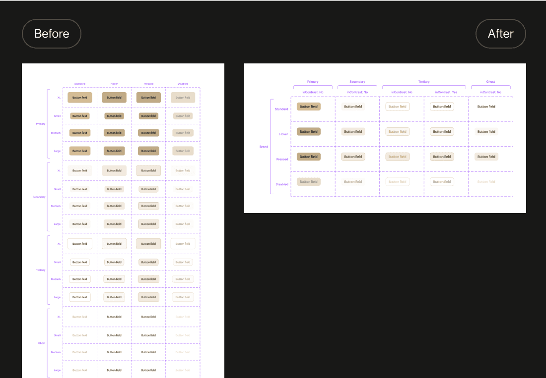
Managing multiple button size variants (small, medium, large) in Figma led to bloated files, made scaling difficult, and slowed down the design workflow. Manually updating each variant was inefficient and made the system harder to maintain especially as the product grew.
The Solution
To address this, I implemented a variable-based sizing and corner radius system. By using context-aware values and Figma variable modes, I eliminated the need for redundant size variants reducing component variants by approximately 97%. This approach made the components more scalable, lightweight, and easier to manage across screens and themes.
Visually Manage Figma Variables
Design-Dev Workflow
Token Pipeline: From Design to Code
Challenges
After carefully designing the UI, I noticed that the final product didn’t fully match the design even small details like spacing felt off. As a designer, those inconsistencies stood out. That’s when I realized the challenge: I needed a better way to ensure that Figma Variables, tokens, and components translated accurately into development. How could I turn all of this into code and create a smoother, more reliable handoff?
The Solution
To solve this, I built a token pipeline that connects Figma Variables to development using Token Studio, GitHub, and Style Dictionary. This setup allowed me to convert design tokens into code automatically and accurately ensuring that what’s designed in Figma is what gets shipped. It streamlined handoff, reduced inconsistencies, and kept the design and dev sides perfectly in sync.

Documentation with Supernova
Structured guidelines for designers and developers, token references, naming conventions, visual theming previews, and usage examples, with documentation still in progress and continuously updated as the system evolves.
Impact & Results
Accelerated UI design time and reduced repetitive work through reusable patterns
Improved cross-platform consistency with fewer UI bugs during implementation
Created a flexible token and theme system that will support Colourtone’s growth into new features and platforms
The token pipeline automated the flow of updates from design to development, reducing manual work, ensuring consistency across platforms, and streamlining handoff through automated syncing and clear documentation.
What I Learned
Scalable Design Architecture
How to build systems that evolve with product demands and platform complexity
Token-Based Thinking
Structuring UI with semantically meaningful and reusable tokens
Multi-Platform Adaptability
Adapting a single design system to work various screen sizes across iPhone, iPad, and mac/desktop platforms.
Cross-Functional Collaboration
Aligning design and engineering with shared systems and clear documentation
Design Ops Practices
Streamlining onboarding and implementation for designers and developers alike
Final Thoughts
This was one of the most rewarding system projects of my career. I’m incredibly proud of how the design system empowered teams to build faster, more consistently, and with a shared understanding. It’s a foundation that will grow with the product not just a system, but a strategic asset.
The Colourtone redesign is currently in its development phase, and I’m excited to see everything come to life soon. It’s incredibly rewarding to see how far it’s come and even more exciting knowing what’s ahead.