Boosting Workout App Conversions by 30.5% Through Heuristic Evaluation
Boosting Workout App Conversions by 30.5% Through Heuristic Evaluation
We conducted a heuristic evaluation of an existing workout app to identify usability issues that hinder user experience. This formed the foundation for a complete UX and UI redesign aimed at improving functionality, accessibility, visual consistency, and user engagement.
Article Voiceover
0:00/1:34
0:00/1:34
Role
UI Designer
Skills
UI Design
UX Design
Redesign
Design Audit
Team
Ross - Team Lead
Sam - UI Product Designer
Hannah - UX Product Designer
Timeline
August 2023 - October 2023
Project Goal
Improve usability and visual design, reduce friction in user flows, and enhance the overall experience for fitness enthusiasts through both UX improvements and a fresh, modern UI.
What is Glow with Sarah?
A personal training app by Sarah Magusara. That offers a range of workouts and challenges tailored to your activity level that can be done with or without equipment.
Heuristic Evaluation
We evaluated the app based on Jakob Nielsen’s 10 Usability Heuristics. Each designer independently reviewed the app, then we consolidated our findings for prioritization.
Visibility of System Status
The system should always keep users informed about what’s going on
Match Between System and the Real World
Use familiar words, icons, and concepts.
User Control and Freedom
Let users undo or back out easily.
Consistency and Standards
Stick to platform or design conventions.
Error Prevention
Stop problems before they happen.
Recognition Rather Than Recall
Make info visible, don’t make users remember.
Flexibility and Efficiency of Use
Allow power users to speed up actions.
Aesthetic and Minimalist Design
Keep the UI clean and focused.
Help Users Recognize, Diagnose, and Recover from Errors
Use clear, helpful error messages.
Help and Documentation
Offer help that’s easy to find and understand.
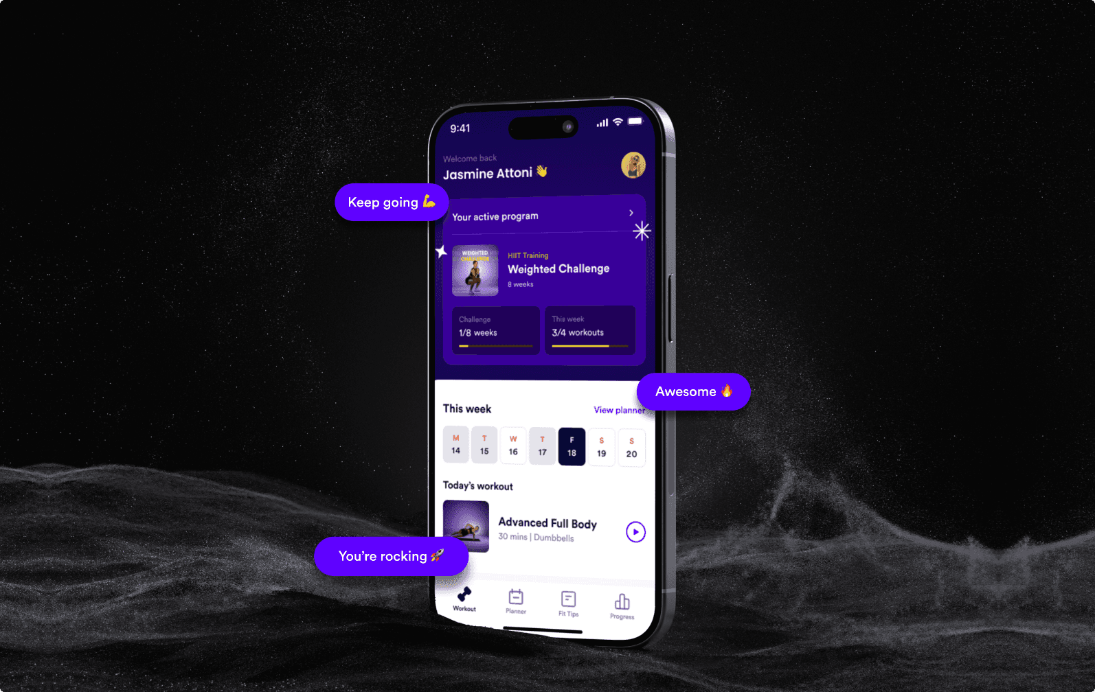
Homepage

Usability Heuristic
Visibility of System Status
Problem:
The original homepage displayed a generic challenge without reflecting the user's personal progress. There was no indication of how many weeks were completed, the number of workouts done this week, or the workout scheduled for the day.
Solution:
The redesigned homepage acts as a real-time dashboard:Displays the user’s current programShows week and workout completion statusHighlights today’s workout with time and equipment infoIncludes a visual calendar to indicate the current dayThis gives users clear, immediate feedback on their fitness journey.
Usability Heuristic
Match Between System and the Real World
Problem:
The original design prioritized marketing content (e.g. "Sarah’s Summer Body Challenge") over user-specific context, creating a disconnect between what users expected to see and what was shown.
Solution:
The new design welcomes the user by name, shows their personal challenge, and contextualizes the experience using workout language that feels familiar and actionable
Usability Heuristic
Aesthetic and Minimalist Design
Problem:
The previous layout lacked structure and visual hierarchy. The CTA button was highly saturated and overpowered other elements.
Solution:
The redesign embraces a sleek, high-contrast theme with vibrant accents. Key content areas are separated using space and card-like containers. A unified type system improves readability and flow.
Usability Heuristic
Recognition Rather Than Recall
Problem:
Users had to remember their active program, how many workouts they’ve done, and what’s next — none of that was visible on the homepage.
Solution:
All essential information (program name, week status, current workout, calendar view) is immediately visible on the home screen, eliminating cognitive load and supporting habit formation.
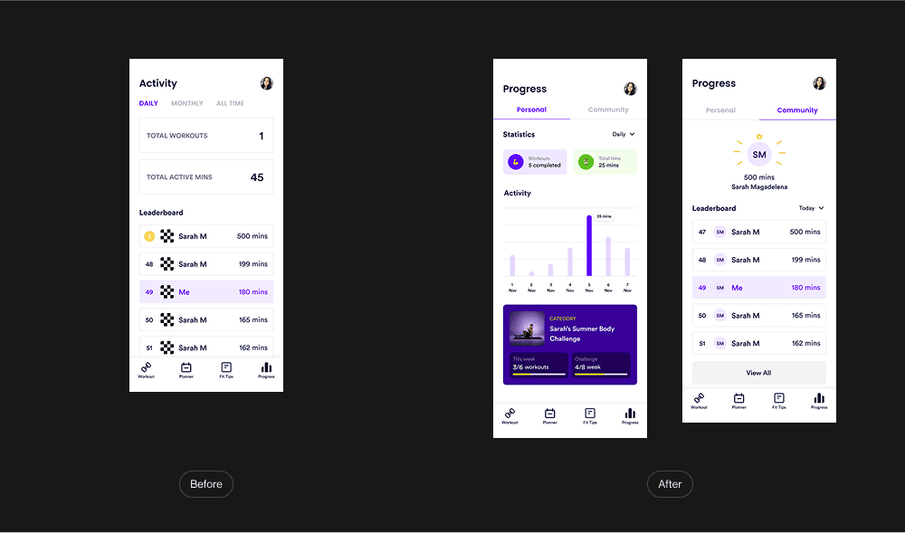
Progress Page
Usability Heuristic
Visibility of System Status
Problem:
The original progress screen only displayed the total workouts and minutes, without contextual data or trends. Users couldn’t tell how they were progressing over time or how they ranked in the community.
Solution:
Visual stats for workouts and total active time Daily bar chart for minute trends Clear challenge progress (e.g., 3/6 workouts, 4/8 weeks) Leaderboard visibility with better structure and user highlighting
Usability Heuristic
Recognition Rather Than Recall
Problem:
Important performance trends and progress markers were hidden or missing. Users had to mentally track improvements over time.
Solution:
Progress is now visualized using a bar chart, labeled workout challenges, and direct stat feedback, so users recognize patterns at a glance.
Usability Heuristic
Consistency and Standards
Problem:
The original leaderboard used icons and typography that felt inconsistent with the rest of the app and didn’t emphasize user placement well.x
Solution:
The leaderboard is now integrated within a tabbed navigation structure and follows the same design language as the rest of the app. It clearly shows the user’s position with consistent styling.
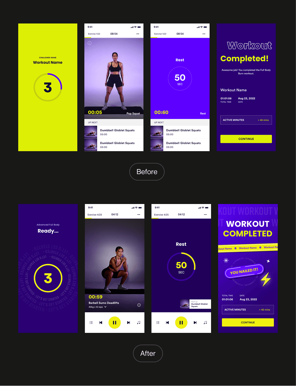
Workout Flow
Usability Heuristic
Aesthetic and Minimalist Design
Problem:
The original workout screens used bright yellow and harsh color contrast that distracted from the exercise itself. Typography and layout lacked visual balance.
Solution:
The new design adopts a refined dark theme with a focus on the workout content. Primary colors are used intentionally for actions and highlights, while secondary content (e.g., "up next") is clearly structured without overpowering the screen.
Usability Heuristic
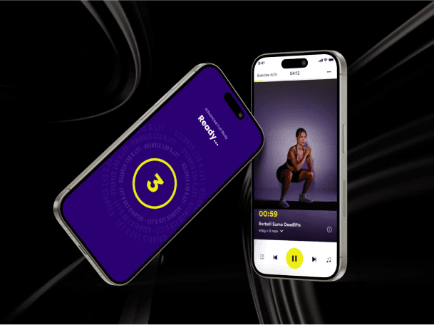
Visibility of System Status
Problem:
There was no consistent visual cue for time left, exercise number, or workout progress throughout the flow.
Solution:
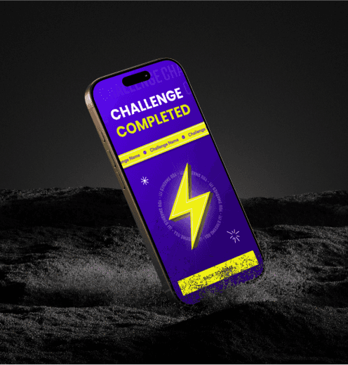
A circular timer is introduced for both exercise and rest periods The workout title, timer, and progress are visible at all times End screen summarizes session stats and confirms completion with celebratory UI
Usability Heuristic
Visibility of System Status
Problem:
There was no consistent visual cue for time left, exercise number, or workout progress throughout the flow.
Solution:
A circular timer is introduced for both exercise and rest periods The workout title, timer, and progress are visible at all times End screen summarizes session stats and confirms completion with celebratory UI
Usability Heuristic
Recognition Rather Than Recall
Problem:
Users had to remember what exercise was next and how long each session would be.
Solution:
A persistent "Up Next" section is included on workout and rest screens, ensuring users always know what's coming.
Usability Heuristic
Recognition Rather Than Recall
Problem:
Users had to remember what exercise was next and how long each session would be.
Solution:
A persistent "Up Next" section is included on workout and rest screens, ensuring users always know what's coming.
Usability Heuristic
Recognition Rather Than Recall
Problem:
Users had to remember what exercise was next and how long each session would be.
Solution:
A persistent "Up Next" section is included on workout and rest screens, ensuring users always know what's coming.
Usability Heuristic
User Control and Freedom
Problem:
The previous design had minimal control features and didn’t accommodate user preferences such as pausing, skipping, or adjusting music.
Solution:
The new workout UI includes intuitive control buttons: pause, skip, and music access. The interaction is fluid and designed for workout environments.
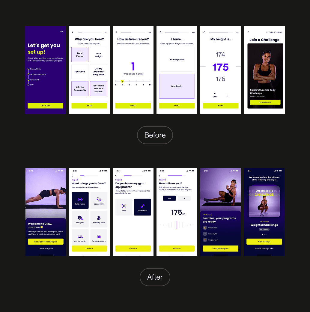
Onboarding Flow
Usability Heuristic
Aesthetic and Minimalist Design
Problem:
The original onboarding felt form-heavy and uninspired. The rigid structure and plain UI failed to motivate users or reflect the brand’s energy.
Solution:
The redesigned onboarding flow uses full-screen visuals, fitness photography, and bold colors to engage users emotionally. The typography and layout now reflect a more empowering tone.
Usability Heuristic
Recognition Rather Than Recall
Problem:
Users had to mentally recall preferences without visual support.
Solution:
The update replaces inputs with tappable cards and sliders, guiding users with visual choices like equipment type or fitness goal, making the experience faster and easier.


Results
30.5%
Avg. Conversion Rate
Strong average conversion rate post-redesign, with peaks up to 70% indicating improved first impressions and appeal.
90.4K
App Store Impressions
Steady visibility from August 2023 to April 2025, with a peak of ~6.5K/week in after the redesign, impressions stabilized around 1–2K/week.
18.7K
Total Downloads
Download growth continued into 2024 and 2025, suggesting the refreshed UI helped maintain user interest and trust.
What I Learned
Heuristic evaluations are a fast and effective way to pinpoint critical usability flaws
Collaborative reviews helped reduce personal bias in usability scoring
Prioritizing real-world language and feedback systems significantly improved UX
product designer
Available to work
product designer
Available to work
product designer
Available to work