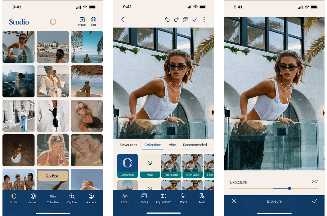
Colourtone is a creative photo and video filter app that brings premium, professional-grade filters to creators, trendsetters, and go-getters. Designed for those who want to elevate their visuals, Colourtone provides an intuitive, high-quality editing experience across multiple devices.
Role
Lead UI Designer
Design System Designer
Brand Designer
Platform
IOS App
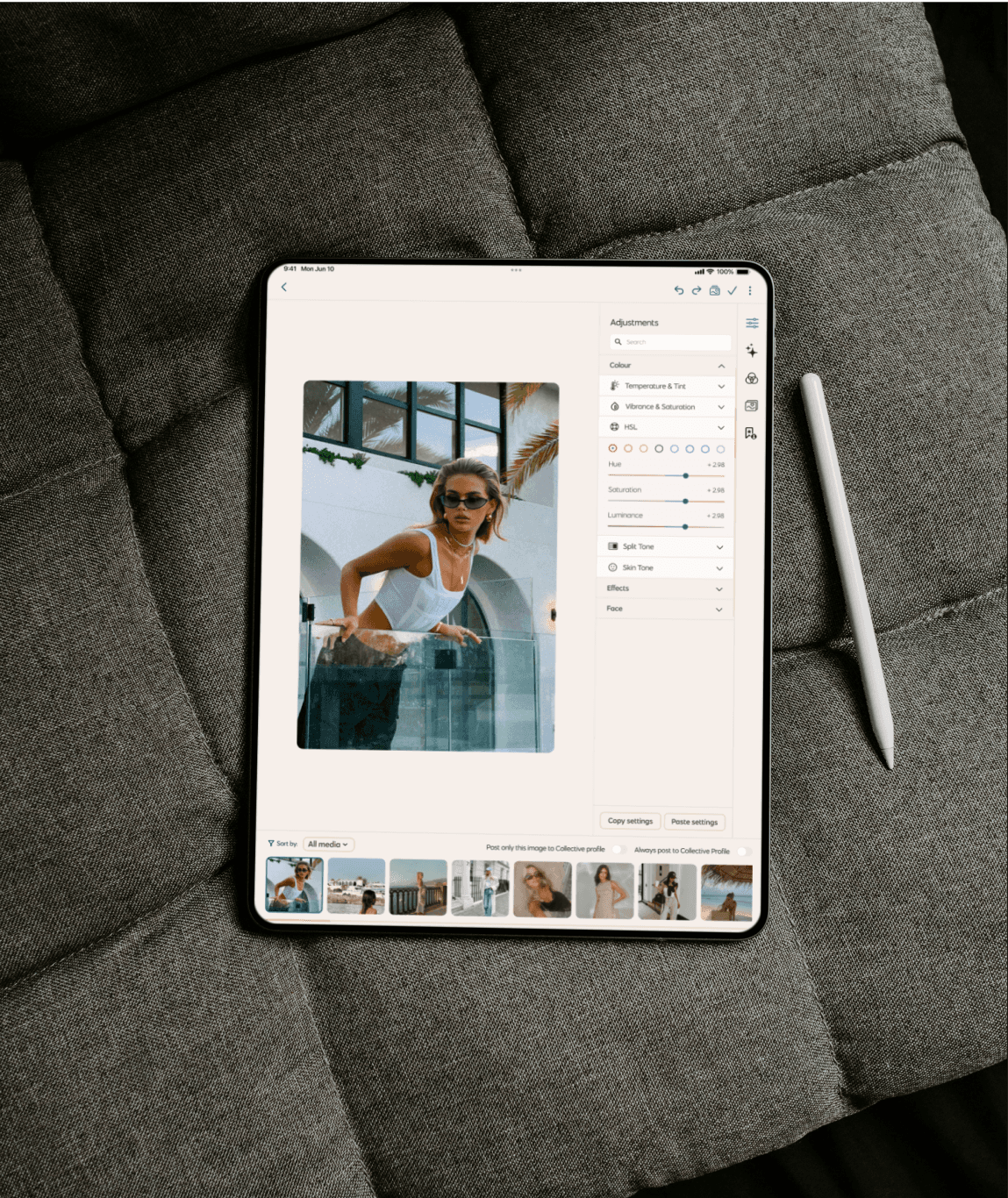
iPad App
Mac / Desktop
Skills
UI Design
UX Design
Design System
Design Token
Logo Design
Rebranding
Redesign
UX Design Audit
Team
Sunny - Project Manager
Sam - Lead UI Product Designer
Estee - UX Product Designer
Timeline
July 2024 - Dec 2024
My Role
As the Lead UI Designer, I spearheaded the redesign and rebranding of the app, ensuring a seamless and cohesive experience across iOS, iPad, Mac, and desktop platforms. My key contributions included:
Redesigning, UX Design Audit & Refining UI
Enhanced the overall user experience with a modern, intuitive, and visually appealing interface.
Creating a Design System
Developed a scalable design system with both light and dark themes, ensuring consistency across platforms using design tokens.
Expanding to Multiple Platforms
Designed experiences optimized for iOS mobile, iPad/tablet, and Mac/desktop.
Introducing New Features
Integrated additional functionalities to enhance the user experience.
Our Process
Our approach to the Colourtone redesign was structured and iterative, ensuring that each phase contributed to an enhanced user experience and scalable design system.
Discover Phase
User research, app review, and problem hypothesis workshop.
Define Phase
Research synthesis, user personas, journey mapping, and problem framing.
Ideation Phase
Solution co-design, information architecture, and user flows.
Design Phase
Rebranding, UI redesign, and design system development.
Prototype & Test Phase
Usability testing, interactive prototyping, and iteration.
Implementation Phase
Developer handoff, final UI refinements, and QA.
Problems & Goals
Problems
The app UI felt outdated, crowded, and visually overwhelming.
There was no centralized design system, making updates inconsistent and time-consuming.
The mobile-only app restricted creative workflows across larger screens like tablets and desktops.
No Support for both light/dark themes.
Goals
Improve usability and enhance overall user experience (UX).
Build a flexible and scalable design system for long-term efficiency with multi-theme and multi platform support for consistency
Rebrand the app with a modern and professional visual identity.
Launch a new social hub for sharing tones, edits, and community interaction.
Introduce AI-powered editing features for smarter workflows.
Design Review:
UX Design Audit
Before starting the redesign, we conducted an app design review to analyze the existing interface, user experience, identify pain points, and determine areas for improvement. Key findings included:
UI Inconsistencies
Variations in button styles, spacing, and typography.
Navigation Complexity
Users found it difficult to locate key features.
Limited Customization
Lack of options for personalizing the editing experience.


Information Architecture
& Key User Flow
Before starting the redesign, we conducted an app design review to analyze the existing interface, identify pain points, and determine areas for improvement. Key findings included:
Simplified Navigation
Restructured menus and categories for easier access to essential features.
Optimized User Flows
Ensured a seamless journey from photo/video selection to final edits.
Feature Prioritization
Arranged tools based on user behavior and frequency of use.
Scalability Considerations
Designed the structure to accommodate future features and updates.

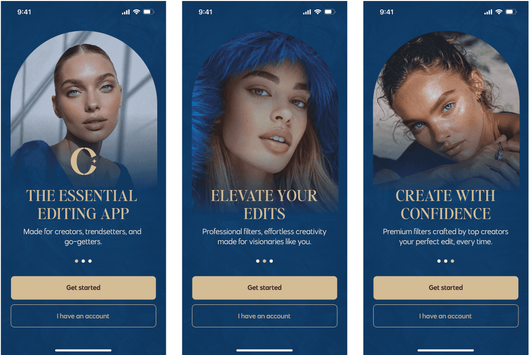
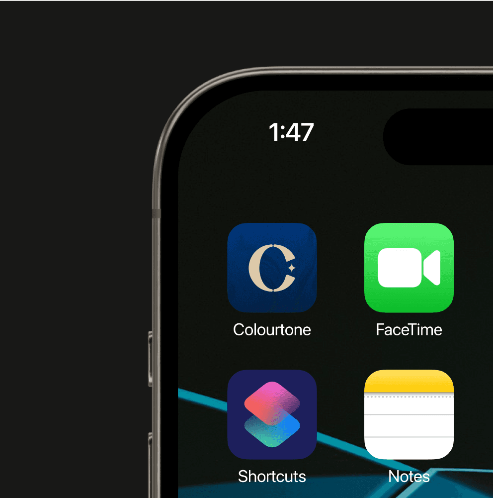
Rebranding:
A Fresh Visual Identity
As part of the redesign, we also rebranded Colourtone to align with modern aesthetics and user expectations. Our rebranding efforts included:
Logo Refresh
Modernized the logo for a sleek and contemporary look.
Color Palette Update
Developed a fresh and vibrant color scheme that enhances both light and dark themes.
Typography Refinement
Chose typefaces that improve readability and align with the brand’s creative personality.
UI Components Revamp
Updated buttons, icons, and visual elements to reflect a premium, professional feel.
Old Logo and Branding

New Logo and Branding


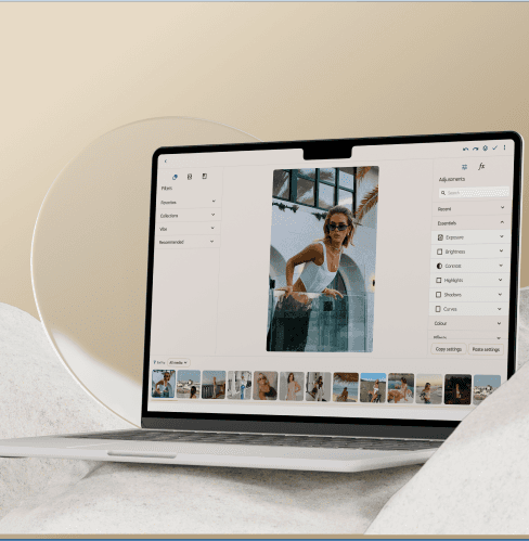


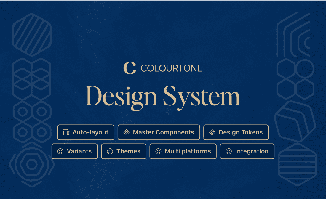
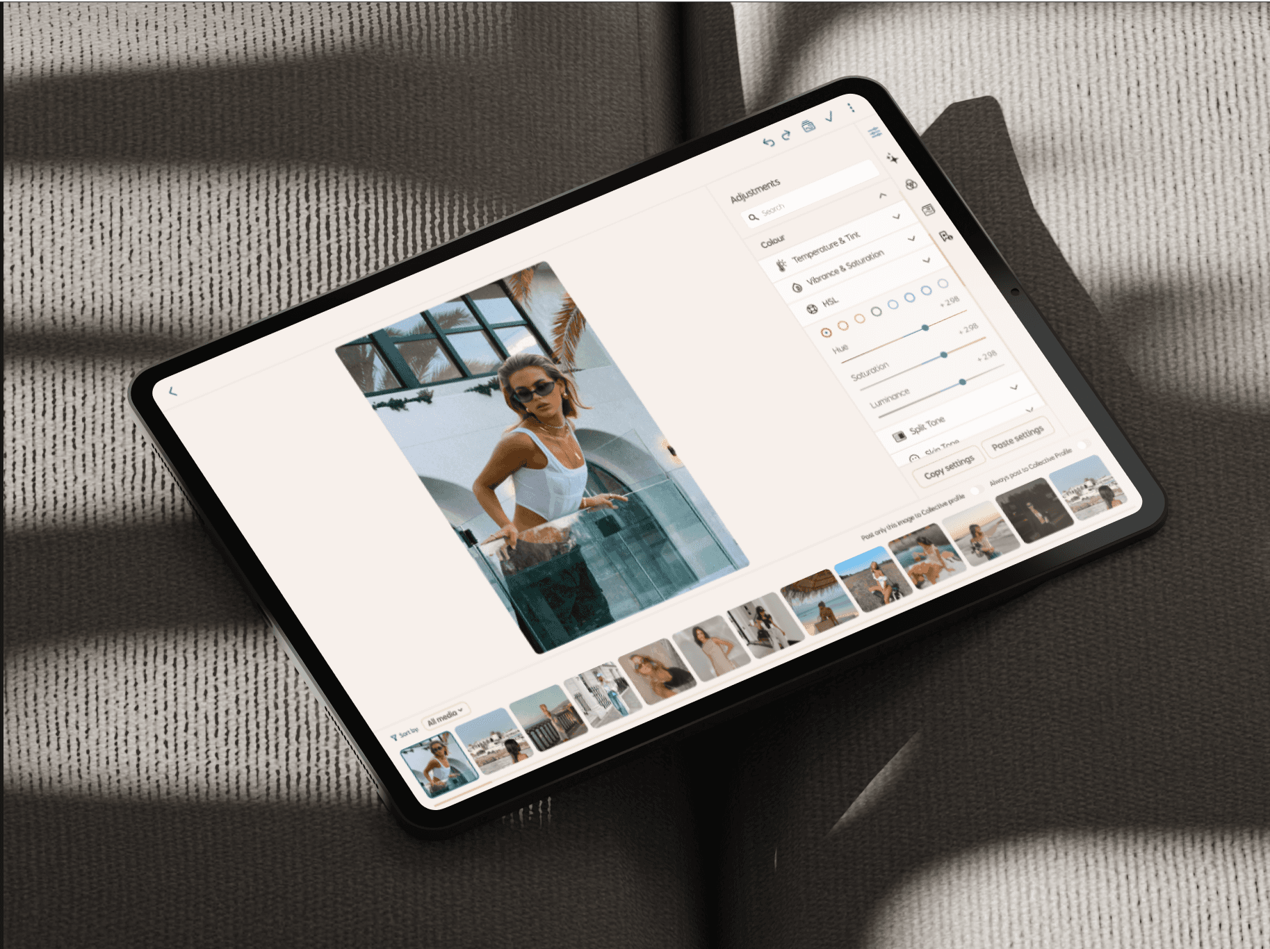
Design System Overview
To ensure consistency and scalability, we developed a comprehensive design system. This system includes:
Typography & Colors
A scalable typography system and a versatile color palette supporting light/dark themes.
Grid & Layout
A flexible layout system that adapts to different screen sizes.
Figma Variables / Design Tokens
Making it easier to maintain consistency across platforms. These variables are particularly helpful in managing colors, spacing, and typography efficiently.
Components
Reusable UI components, including buttons, sliders, and modals.
Integrations
Create a shared source of truth through token pipelines and system documentation
Documentation
Updated buttons, icons, and visual elements to reflect a premium, professional feel.
For an in-depth look at the design system, including its principles, structure, and implementation across platforms, view the full Colourtone Design System Case Study.
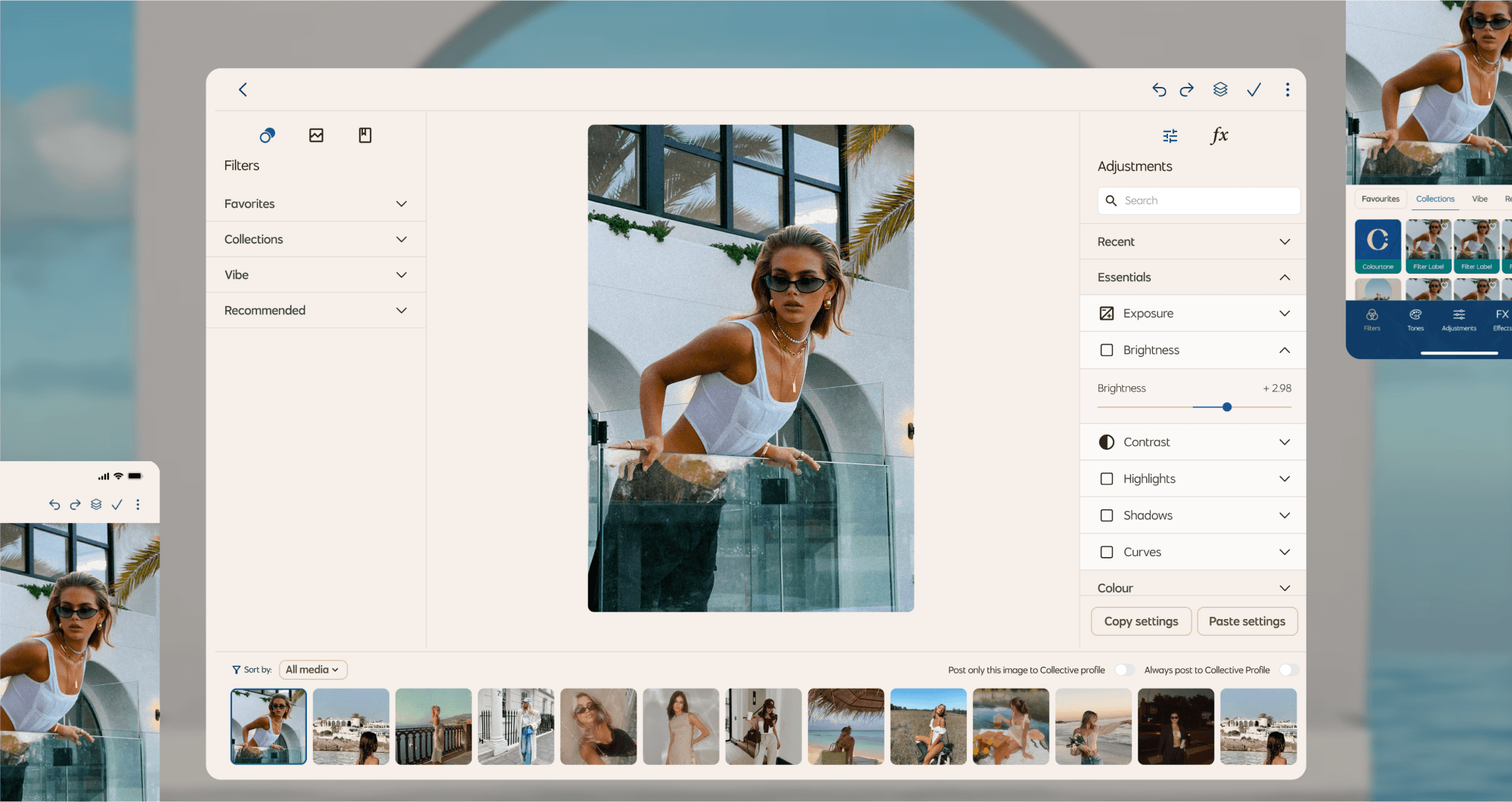
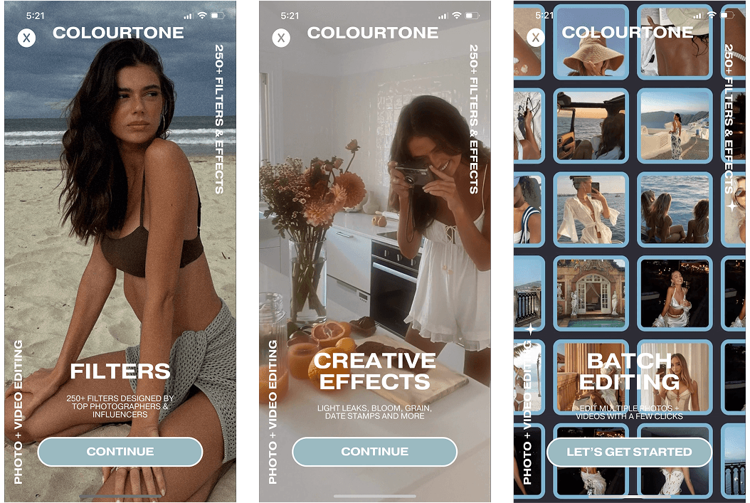
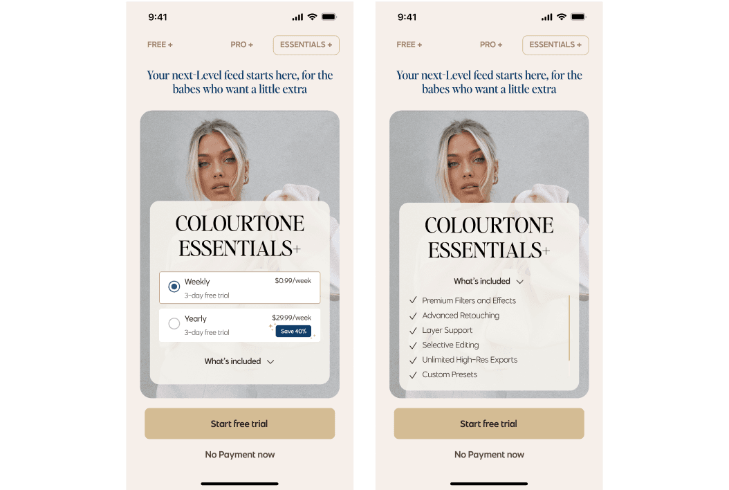
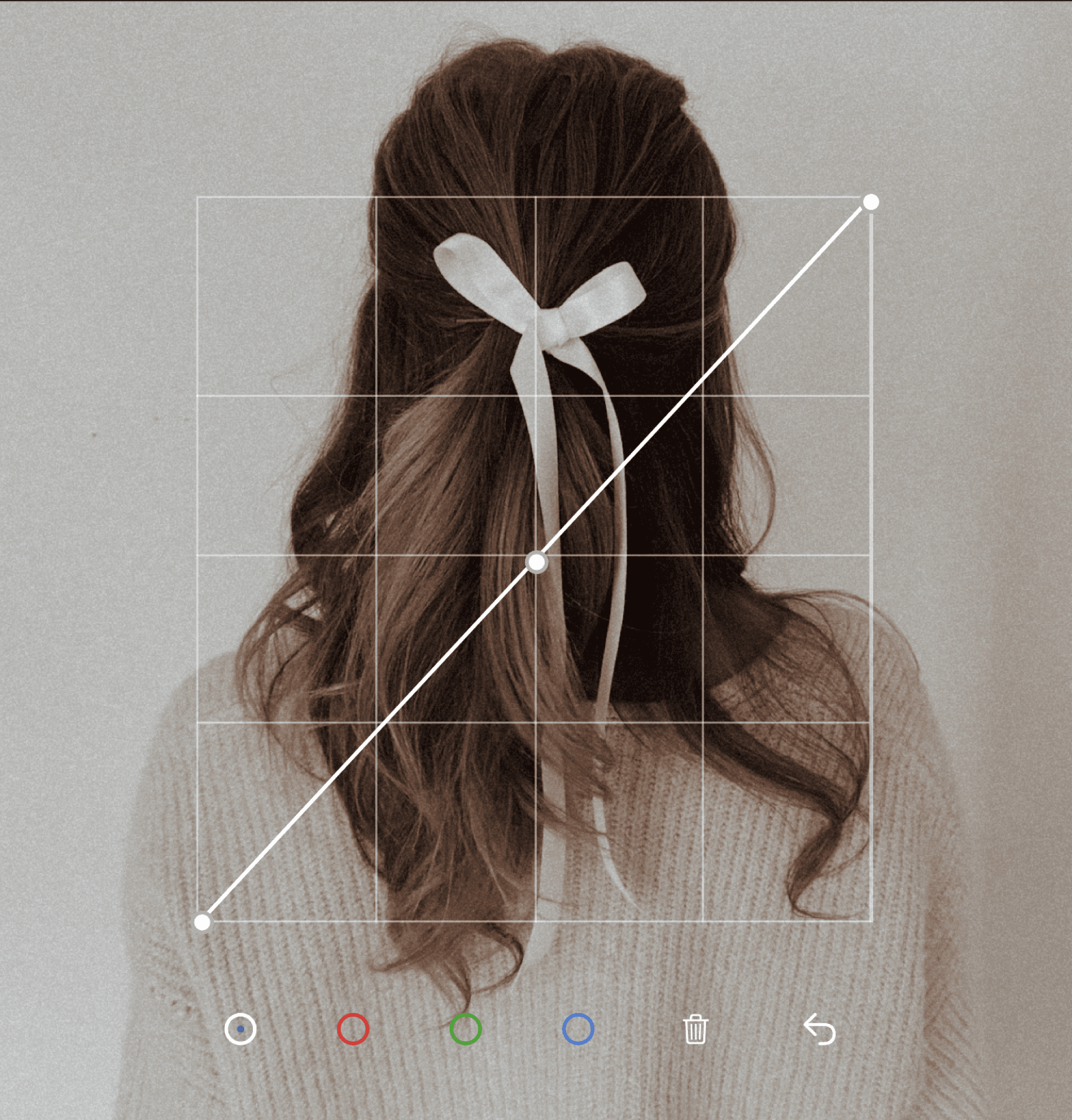
Final Outcome
Some of new features
Onboarding questions
We enhanced the onboarding experience by introducing questions about the user's skill level and editing style. This allows the app to personalize recommendations, adjust tool accessibility, and create a more intuitive workflow tailored to each user’s expertise and creative approach.
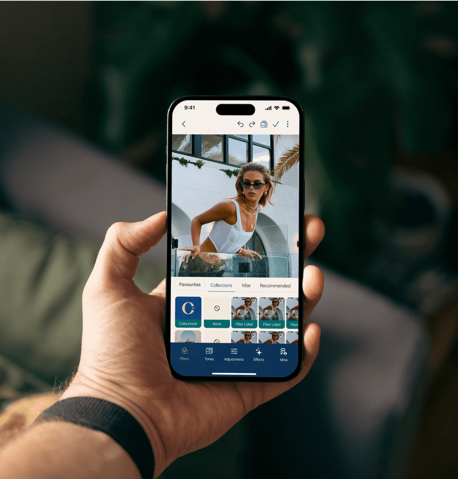
Explore Page
The new Explore page offers a dynamic space where users can discover and experiment with a variety of filters, tones, vibes, and templates.
This feature enhances creativity by providing curated options that align with different aesthetics and moods, making it easier for users to find the perfect edit.
Collective Page
The Collective page is a vibrant community space where users can connect, share, and inspire.
Personalized Feed – Stay updated with curated content, drop reactions, and engage with the community.
Create Your Profile – Showcase your aesthetic, post edits, and share custom tones.
Video Features – Upload and explore editing videos, favorite filters, and creative processes.
Groups – Find your tribe, chat, and share editing tips.
Share Your Tones – Upload personal tones and discover edits from others.
Exclusive Tutorials – Unlock premium content to elevate your editing skills.
Chat & Connect – Join group chats, slide into DMs, and never miss the action.

What I Learned
This project was as challenging as it was rewarding. I was especially proud of the design system I created—it had a significant impact on scaling the UI across multiple platforms and themes. It felt like a huge step forward, and the system can now serve as a foundation or template for future projects.
Scalability of Design Systems
Developing a flexible and scalable system that works across multiple platforms reinforced the importance of planning for future growth.
User-Centered Iteration
Conducting usability testing and iterating based on feedback helped create a product that genuinely meets user needs.
Multi-Platform Adaptability
Designing for mobile, tablet, and desktop reinforced the need for adaptable UI components and layouts.
Efficient Use of Figma Variables and Design Tokens
Leveraging Figma’s latest tools helped streamline handoff and maintain consistency across different themes and platforms.
Next Steps
The Colourtone redesign is currently in its development phase, and I’m excited to see everything come to life soon. It’s incredibly rewarding to see how far it’s come—and even more exciting knowing what’s ahead.
Maintaining & Scaling the Design System
Continue refining the system to support future features and platforms, ensuring consistency and flexibility as the product grows.
Advancing Design Tokens
Further develop Figma variables and platform-specific tokens to enable seamless multi-theme support (light/dark) across iOS, iPad, and desktop.
Design System Documentation & Team Enablement
Continue to build and update robust documentation to help developers and designers adopt the system efficiently across teams.
Feedback & Iteration Post-Launch
Once the app is live, collect user feedback and run usability tests to iterate on new features and improve the overall UX.
Exploring Future Feature Opportunities
Stay adaptable and forward-looking—ready to design and implement new experiences based on product evolution and community needs.